Branding · Framer Website · Booking · Hospitality
The name said cabins. The plans did not.

Context
Three engagements, one person, no handoffs.
Domki Morena rents holiday cabins by Lake Powidz in western Poland. A small operation: a handful of cabins, a season that decides the year, an owner who answers the phone herself.
It began with a phone call in which she described what she hoped to make of the place one day. That was not a rebrand brief. It was an ambition, and everything that followed came out of it: the brand first, then the website, then the booking that runs inside the site.
Problem
Nothing was broken. That is the honest version.
The rest of the problem was quieter. Availability lived in one person’s head, every enquiry needed a reply written by hand, and a booking could only be confirmed during the hours a person was free to confirm it. What that costs is invisible, because you never meet the guest who checked availability at eleven at night and booked somewhere else.
Decisions
Six decisions, starting with the name.
Morena is the brand, the cabins are one part of it
The name stays. The structure underneath it changes. “Domki Morena” became “Domki” sitting inside “Morena”: one component of a parent brand instead of the whole of it. Whatever the business adds later becomes another component under the same name. This was not an idea I brought to her from the outside. It was the shortest way of saying back to her what she had told me on the phone.
A logo that is not a cabin
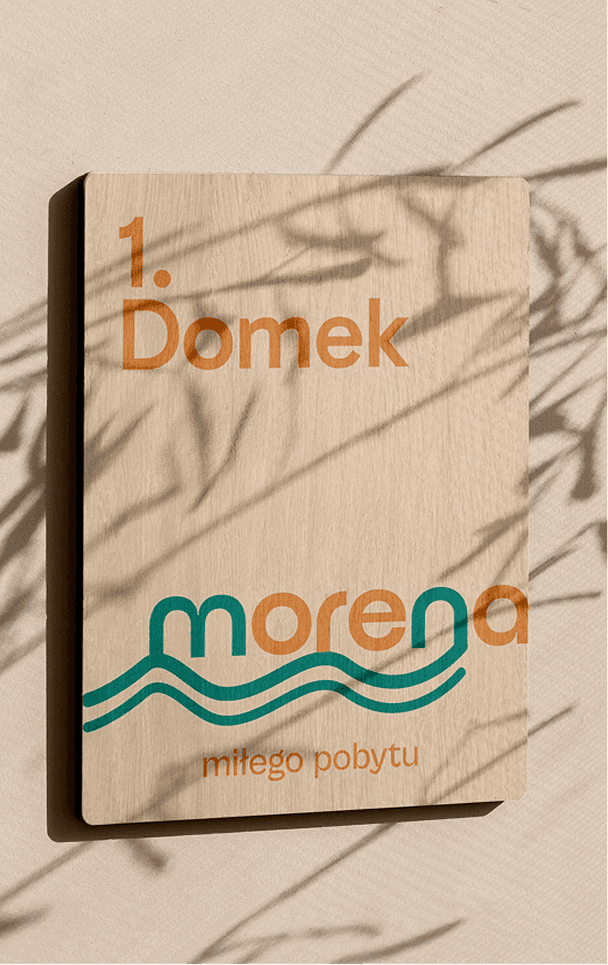
Cabin rentals brand themselves with cabins, pine trees and pitched roofs. That is the entire category, and a mark built out of it is a mark that looks like everybody. The logo is a wordmark on water: two lines running under the name and through the letters as a lake surface, an o that reads as the sun on that surface, and an r shaped like a snorkel. Warm letters against cool ones. It says water and summer without ever saying cabins, which is exactly the room the parent brand needed.
Warm, not exclusive
Her one constraint was the useful kind. She wanted the place to keep its own character, and she did not want it turned into something exclusive. That settled the palette before it settled anything else. Turquoise for the water, a sunset orange against it, sand beige for the ground and a deep navy where text needs to hold, with lowercase throughout. The plaque designed for each cabin door reads miłego pobytu, have a good stay, which is what a host says and not what a resort says.

The background colour she did not like
Early on she wrote to say the background was not what she had expected. It stayed. The beige is the one colour in the palette doing no work of its own: it is the ground the turquoise and the orange stand on. White would have made the site colder than the place it sells, and anything stronger would have put the background in a fight with the photographs. She pushed on it, which is the right thing to do with a colour you are going to look at every day. I gave her the reason rather than a different colour, and the reason held.
The site sells the place before it takes the booking
The website is the first place the brand exists in full, so it opens with the brand and leaves the booking form for later. The tagline carries the whole hero: odpoczynek, naturalnie. Rest, naturally. Under it, photographs of the cabins that are actually there, and copy in the brand’s own voice: unhurried, host to guest, and short of adjectives, because the photographs are already doing that work.

Built into the site, not bolted onto it
An off-the-shelf booking widget would have taken a cut of every reservation and put another company’s interface into the middle of an identity I had just finished building. I built it instead. A guest picks dates, sees real availability and the price for that season, and pays without leaving the site or the brand. The owner runs everything else from an admin panel that belongs to her, on infrastructure in her name. The build itself is a longer story than this page needs. Here it matters as the last piece of one brand: the point where a guest stops looking and pays.

Result
A brand with room to grow, and a booking desk that never closes.
The name no longer limits the business to the thing it currently sells. Morena is the brand and the cabins are one part of it, so the next thing she adds arrives under a name that already made room for it.
Availability used to live in one person’s head, and a booking could only be confirmed during the hours someone was free to confirm it. Now a guest who checks at eleven at night books at eleven at night.
Guests choose dates, see real availability and seasonal prices, book and pay online without leaving the site. The owner runs the rest from the admin panel - reservations, blocked dates, cabins, seasons, promotions.
“I told him what I hoped to make of this place one day.
He built a brand where the cabins are only the beginning.
He picked colours that finally look like us.
The booking are his too,
so a guest books at eleven at night while I’m asleep.”
Greta Polak · Owner, Morena